Anatomy of this WeWeb search dropdown component
This WeWeb search dropdown component appears to be fairly simple, with just two dropzones and a few properties. And it indeed is quite like that.
Input dropzone
This dropzone serves as a trigger for the dropdown, it usually is your “search input”, but thanks to this being a dropzone, you can add icons, buttons and all the other things you might need in your search dropdown.
{
  "settings": {
    "open": false // Dictates the state of the dropdown
  },
  "selection": {
    "id": 1,
    "name": "Broski's Brand",
    // Your selected item's data here
  }
}
Dropdown dropzone
This dropzone serves as a list of all the possible results, again, thanks to this being a dropzone, you can basically build anything here. It’s similar to the free-mode in the WeWeb’s dropdown select component. In order to repeat the items inside of it, you need to place a container, or a div in it, and repeat the items inside of it. This was a choice to allow you maximum flexibility.
[
  {
    "id": 333,
    "name": "NO-BRAND Studio",
    "last_sync": "2024-06-17T15:50:16.742975"
  },
  {
    "id": 334,
    "name": "JUVENILE®",
    "last_sync": "2024-06-17T15:50:16.742975"
  }
  // Your collection's items
]
Component’s properties
This component has a little more component actions than your usual WeWeb component, it’s a little bit more of setup, but it brings huge flexibility to you, the users, so I think it’s the right amount.
| Dropdown distance | Dictates the distance of the dropdown from the head of the component |
| Source collection | Dictates the collection that will be used to fetch and display the data in the search |
| Force open in the editor | Dictates whether the dropdown should be visible (open) in the editor. This is very helpful for editing the dropdown’s contents. |
Component’s workflows
This component has a little more component actions than your usual WeWeb component, it’s a little bit more of setup, but it brings huge flexibility to you, the users, so I think it’s the right amount.
| Open the dropdown | Opens the dropdown, sets the settings.open to true |
| Close the dropdown | Closes the dropdown, sets the settings.open to false |
| Select the item | Selects the item of your choice and assigns it to the component state’s selection property |
| Fetch the data | Fetches the selected collection’s data by refreshing your choosen collection |
Clicks inside of the dropzone
This component leverages the default behavior of the Input field, to be specific the HTML focus and blur events. This was prevalently a choice of mine, because I didn’t want to use useless JavaScript unless needed.

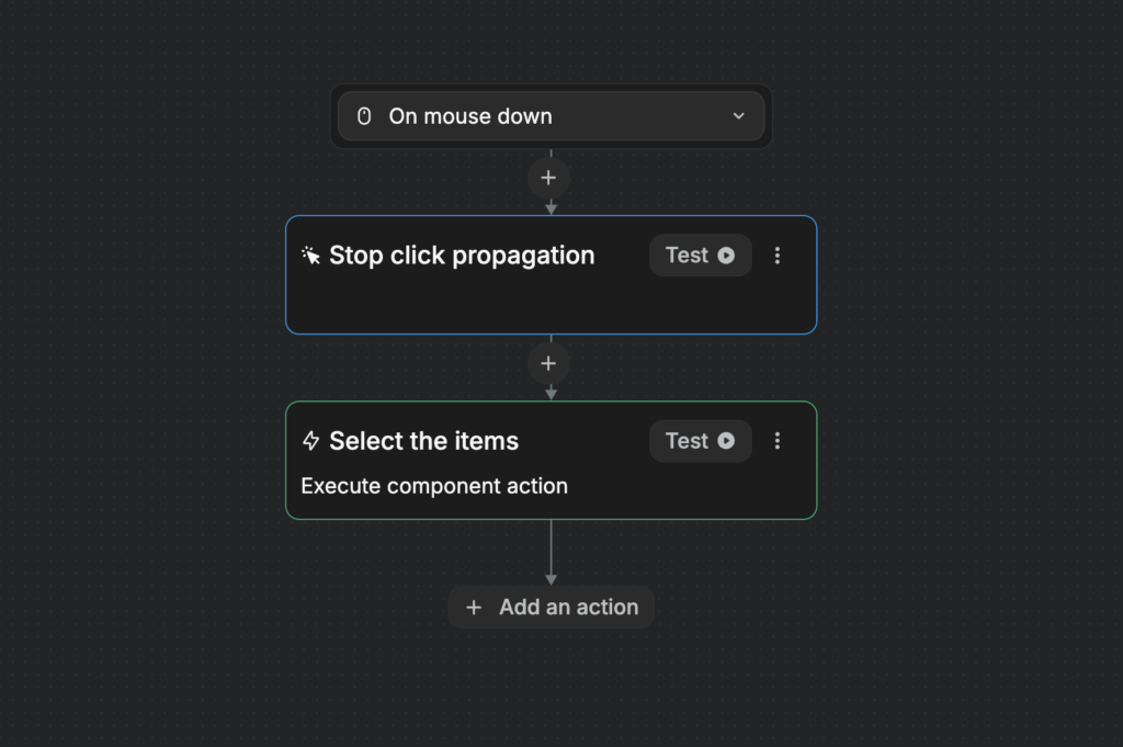
If you’d like to work with clicks inside of the dropzone, you’ll need to use the On mousedown property instead of the default On click property, as the mousedown fires before the blur. If you’d like to have multiple clicks inside of the dropdown, you can simply use the Stop click propagation on the mousedown trigger event, so that the click doesn’t propagate to the blur.